http://visalix.xrce.xerox.com/index.php?page=help
This is an example of a star plot. I found this map to be very neat. It shows data in a three dimensional way so that you can see how everything is related. On most star plots, the end of the long axis' are labeled and the dots are the data. It is a map because it is displaying data in a three-dimensional way.
Keith Munday's Maps
Tuesday, April 3, 2012
Correlation Matrix
http://www.kltprc.net/policynotes/Gifs/Tab_005A_4.htm
This is an image of a correlation matrix. This shows the correlation between things and will tell you if two or more things are related. It is a map because it shows a lot of different information in one image.
This is an image of a correlation matrix. This shows the correlation between things and will tell you if two or more things are related. It is a map because it shows a lot of different information in one image.
Similarity Matrix
http://mendel.ethz.ch:8080/Server/ServerBooklet/section2_14.html
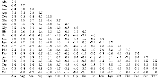
This is a similarity matrix. It shows correlations amongst different things. This similarity matrix map shows similarities in the amounts of amino acids. It is a map because it has mapped out the numbers over space.
This is a similarity matrix. It shows correlations amongst different things. This similarity matrix map shows similarities in the amounts of amino acids. It is a map because it has mapped out the numbers over space.
Stem and Leaf Plot
http://www.shmoop.com/basic-statistics-probability/stem-leaf-plots.html
This is a Stem and Leaf Plot. It is a very clear way to show data. On the left hand side (stem) you have the first digit and that number is what all the numbers on the right (leaf) start with. So the stem with 9, have the numbers 90 and 94. This is a map because it easily shows information over space.
Sunday, January 29, 2012
Box Plot
http://en.wikipedia.org/wiki/Box_plot
This is called a Box Plot. The boxes represent data. The lines within the boxes represent the median of the data. The two edges of the boxes represent the range (highest and lowest) of that set. This graph represents the speed of light between different experiences.
This is called a Box Plot. The boxes represent data. The lines within the boxes represent the median of the data. The two edges of the boxes represent the range (highest and lowest) of that set. This graph represents the speed of light between different experiences.
Histogram
http://en.wikipedia.org/wiki/Histogram
This is a histogram. It is another graphical representation showing a visual impression of certain data. It is an estimate of a probability. This graph is just a made-up graph showing the arrivals per minute of a certain something.
This is a histogram. It is another graphical representation showing a visual impression of certain data. It is an estimate of a probability. This graph is just a made-up graph showing the arrivals per minute of a certain something.
Parallel Coordinate Graph
http://florence.acadiau.ca/collab/hugh_public/index.php?title=GGobi_Intro
This is a Parallel Coordinate Graph. While it looks like something made up or that you would see in a movie, if you can take it and dissect it, it makes more sense. It is good for showing bivariate information and how its related.
This is a Parallel Coordinate Graph. While it looks like something made up or that you would see in a movie, if you can take it and dissect it, it makes more sense. It is good for showing bivariate information and how its related.
Subscribe to:
Comments (Atom)


