Tuesday, April 3, 2012

Star Plots

http://visalix.xrce.xerox.com/index.php?page=help


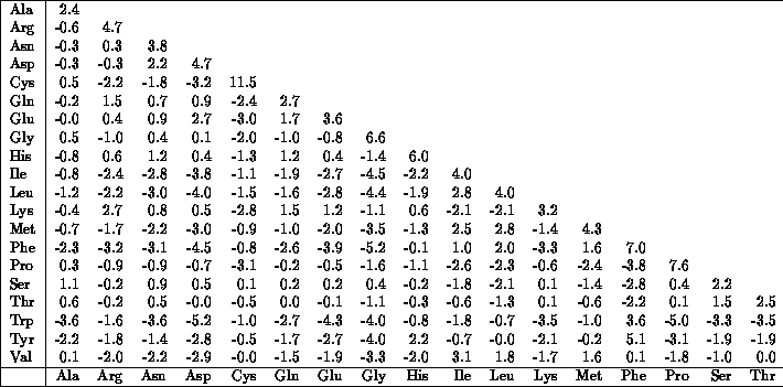
This is an example of a star plot. I found this map to be very neat. It shows data in a three dimensional way so that you can see how everything is related. On most star plots, the end of the long axis' are labeled and the dots are the data. It is a map because it is displaying data in a three-dimensional way.

Correlation Matrix

http://www.kltprc.net/policynotes/Gifs/Tab_005A_4.htm

This is an image of a correlation matrix. This shows the correlation between things and will tell you if two or more things are related. It is a map because it shows a lot of different information in one image.

Similarity Matrix

http://mendel.ethz.ch:8080/Server/ServerBooklet/section2_14.html


This is a similarity matrix. It shows correlations amongst different things. This similarity matrix map shows similarities in the amounts of amino acids. It is a map because it has mapped out the numbers over space. 

Stem and Leaf Plot


http://www.shmoop.com/basic-statistics-probability/stem-leaf-plots.html


This is a Stem and Leaf Plot. It is a very clear way to show data. On the left hand side (stem) you have the first digit and that number is what all the numbers on the right (leaf) start with. So the stem with 9, have the numbers 90 and 94. This is a map because it easily shows information over space.

Sunday, January 29, 2012

Box Plot

http://en.wikipedia.org/wiki/Box_plot

This is called a Box Plot. The boxes represent data. The lines within the boxes represent the median of the data. The two edges of the boxes represent the range (highest and lowest) of that set. This graph represents the speed of light between different experiences.

Histogram

http://en.wikipedia.org/wiki/Histogram

This is a histogram. It is another graphical representation showing a visual impression of certain data. It is an estimate of a probability. This graph is just a made-up graph showing the arrivals per minute of a certain something.

Parallel Coordinate Graph

http://florence.acadiau.ca/collab/hugh_public/index.php?title=GGobi_Intro

This is a Parallel Coordinate Graph. While it looks like something made up or that you would see in a movie, if you can take it and dissect it, it makes more sense. It is good for showing bivariate information and how its related.

Triangular Plot

http://www.dplot.com/triangle-plot.htm

This is an image of a Triangular Plot. It is useful if you have three different things to plot that are related to each other. This shows the amount of sand, clay, and silt in different samples.

Windrose

http://www.maine.gov/dep/air/meteorology/Windrosehome.html

This is an example of a Windrose map. It is a very neat map that is basically a compass that shows where the wind is coming from and the speed that it is blowing. This map is a Windrose for Maine.

Climograph

http://mynasadata.larc.nasa.gov/preview_lesson.php?&passid=74

The above image is an example of a Climograph. It is another graphical representation of a map. This one is a Climograph NASA made for Guam. It shows the precipitation and temperature of Guam throughout the months of the year.

Population Profile

http://www.ifad.org/operations/regional/pf/aids_1.htm

This is a population profile graph. It shows a certain aspect of the population, and it can show the differences between one or more populations. This particular map shows the amount of males and females that have or do not have AIDS, along with the ages of the people.

Scatter Plot

www.wikipedia.org/scatterplot

This is an example of a scatter plot. It plots individual pieces of data on a graph. Then a line is usually drawn to show the mean of all the scattered dots. This is a scatter plot representing the time between eruptions of Old Faithful and the duration of the eruptions.

Index Value Plot

http://www.squarecirclez.com/blog/the-gini-coefficient-of-wealth-distribution/4187

This is another graphical representation of a map called an Index Value Plot. It plots the index value of numbers not their absolute value. This graph shows the index values for a streamflow over 8 years in the United States.

Accumaltive Line Graph or Lorenz Curve

http://www.squarecirclez.com/blog/the-gini-coefficient-of-wealth-distribution/4187

This is an image of a Lorenz Curve. This type of map is another graphical representation. These graphs can show cumulative and probability distribution of a certain numerical category.

Saturday, January 28, 2012

Nominal Area Choropleth Map

http://politicalmaps.org/wp-content/uploads/2007/12/2008-prediction-map-11252007.jpg


This is a Nominal Choropleth Map. It shows numerical data along with colors showing divisions in a certain category. This map is showing the 2008 presidential election. The color represents what party that state was in favor for and the number is showing how many electoral votes that state is given.

Bilateral Graph

http://www.680homes.com/blog/wp-content/rate-chart-april-07.jpg

This is a Bilateral Graph. It shows the correlation between two things. One line shows something becoming more positive and the other shows something becoming negative. This graph is depicting the difference between 30 year fixed mortgages and 30 year fixed jumbo mortgages in California.

Thursday, January 19, 2012

Unstandardized Choropleth Map

http://go.owu.edu/~jbkrygie/krygier_html/geog_353/geog_353_lo/geog_353_lo08_gr/choro_1836.jpg

This is an unstandardized choropleth map. In this style of map there are no identified classes. This map shows the population of Spain with different shades of grays and blacks.

Standardized Choropleth Map

http://www.geovista.psu.edu/grants/nci-esda/research.html


This is a standardized choropleth map. It is considered the normal or standardized choropleth map. It uses a lot of different shades and colors.

Univariate Choropleth Map

http://geographyfieldwork.com/June%202000%20Rainfall%20ChartSmall.gif.


This is an Univariate Choropleth Map. It shows only one variable compared to the bivariate choropleth map which can show data for two different variables. The map above shows the amount of rainfall using just one color but darkening it to show an increase in the amount.

Bivariate Choropleth Maps

http://www.directionsmag.com/images/articles/sportsillustrated/Olympic_Athletes.jpg


This map is a bivariate chropleth map. It is another type of choropleth map but more than one variable can be represented on the map.

Unclassed Choropleth Maps

http://www.mapresso.com/


This is an unclassed choropleth map. The difference between the classed choropleth and unclassed is that the unclassed can be divided into smaller sections not having to do with a particular border.

Classed Choropleth Map

http://my.ilstu.edu/~jrcarter/Geo204/Choro/

This is a classed choropleth map. It shows a particular set of data with different shades of colors taking up a whole country or state. The map above shows the amount of male per 100 males.

Range Graded Proportional Circle Map

http://pubs.usgs.gov/fs/fs-004-03/

This is a range graded proportional circle map. It is a good map for showing more than one set of data. The map above shows the circles like a regular proportional circle map, but it also has something inside the circle meaning something.

Continuously Variable Proportionate Circle Map

http://faculty.frostburg.edu/geog/kessler/geog310/labs.html


This is a Continuously Variable Proportional Circle Map. It shows a certain range of data using circles to show how much or how little is in one place. The map above is showing the population of the state capitals so that it is easy to compare each one. 

Sunday, January 15, 2012

DOQQ

http://www.google.com/imgres?num=10&hl=en&biw=1280&bih=681&tbm=isch&tbnid=TzlRTsuLLnj6hM:&imgrefurl=http://www.utexas.edu/depts/grg/hudson/grg360g/EGIS/final_project/spring04_projects/web_justin_reynolds/Lake%2520Travis.htm&docid=_m--96gsbE-F-M&imgurl=http://www.utexas.edu/depts/grg/hudson/grg360g/EGIS/final_project/spring04_projects/web_justin_reynolds/Lake%252520Travis_files/blue_Travis_doqq.jpg&w=350&h=299&ei=drUTT8rIE4uWtwfRqOyRAg&zoom=1&iact=hc&vpx=424&vpy=156&dur=701&hovh=207&hovw=243&tx=130&ty=124&sig=106376105954718851060&sqi=2&page=1&tbnh=160&tbnw=201&start=0&ndsp=15&ved=1t:429,r:1,s:0

This is a DOQQ map. As you can tell there are a lot of squares on the map dividing this image into regions. DOQQ stands for Digital Orthophoto Quarter Quads. It would be used for dividing projects into simpler segments.

DEM

tahoe.usgs.gov

This map is a DEM map. DEM is short for Digital Elevation Map. It is a digital map that shows the elevation of a region.

DLG

http://en.wikipedia.org/wiki/Digital_line_graph

This is a DLG map. DLG stands for Digital Line Graph. It is a map that is used by the USGS (United States Geolocial Survey) in the digital vector.

DRG Map

http://lter.msu.edu/maps/gis_data.php


This map is a DRG map, standing for Digital Raster Graphic. It is basically just a topographic map in a raster format.

Isopleth

scrabble.wonderhowto.com


This is an isopleth map. This map shows the amount of dioxin in parts of the eastern part of the United States. Each color corresponds to a different amount of dioxin.

Isopachs

http://www.geo.utexas.edu/faculty/barker/kempter/rbtephra.html

This is an isopach map. An isopach map like the one shown above shows the density of rocks, above or underground. These are usually used by geologist looking for petroleum.

Isohyet

http://www.isohyet.com/


An isohyet map like the one shown above shows the amount of rainfall in a particular region. The one shown above portrays through different colors the amount of rain per year in Australia.

Isotachs

acartographicalworld.blogspot.com

This is an isotach map. The isotach map is mostly used in weather and probably boating and moving by water. This map shows wind speeds. The colors represent the wind speeds that are the same.

Isobars

uwlax.edu

This is an isobar map. Isobar maps shows pressure similarities and differences in towns countries or all over the world.

LIDAR

http://www.saic.com/geospatial/modeling/lidar-urban-modeling.html

This is a LIDAR map. LIDAR stands for Light Detction and Ranging. LIDAR uses lasers to depict how far away an object is to get the image. This map is of New York City.

Doppler Map

http://www.stuffintheair.com/Doppler-radar-weather.html


This is a Doppler map. This is used in weather to show where a certain weather pattern is taking place. This map is over Canada and it is showing where the precipitation is taking place.

Black and White Aerial Photos

http://freegeographytools.com/2007/goofing-around-with-pan-sharpening

This is a Black and White aerial photo. It shows streets, neighborhoods, whole cities. This can make it way easier to figure out your way around the city or a certain place.

Infrared Aerial Photos

aerialarchives.com


This is an Infrared Aerial map. It is an image portraying a certain place from overhead, shot from a plane, satellite, or helicopter, and uses infrared for more vast color differences.

Cartographic Animation

http://www.google.com/imgres?um=1&hl=en&biw=1280&bih=681&tbm=isch&tbnid=vJVTyoBrF-x52M:&imgrefurl=http://gis3500mk.blogspot.com/2010/07/cartographic-map.html&docid=L0xWf83GujEPxM&imgurl=https://blogger.googleusercontent.com/img/b/R29vZ2xl/AVvXsEgnBKqZ7dCv7TMAGnAJKpN82Xc17vl0UBETO08tlQeV9rNsQvHQHDRcsFuuX82m2XPMi8f9Zn9EMkkO9nf9p4TUcvqYdNJgDm92EUvDMX1R8GN1tx6kBH_ftcWkpo7A-YqNmg6JZ3QHJ_6K/s400/Cartographic%25252Banimations.jpg&w=400&h=320&ei=hIsTT5iMH4G2twet88XlAQ&zoom=1&iact=hc&vpx=398&vpy=208&dur=1520&hovh=201&hovw=251&tx=141&ty=85&sig=106376105954718851060&page=1&tbnh=136&tbnw=170&start=0&ndsp=17&ved=1t:429,r:1,s:0


This is a cartographic animation map. It shows temporal content using colors and things that will stand out. This map shows different trails around a mountain.

Statistical Map

http://personalpages.manchester.ac.uk/staff/m.dodge/cybergeography/atlas/census.html


This is a statistical map. It seems to be a very simple map. Statistical maps are just images of regions with some kind of statistic about that country or city. The map above shows the internet growth rate of Africa by simply putting a bar on each country representing a certain percentage.

Cadastral Map

worldmapper.org

This is a cartogram of the world. This would be a difficult map to make without some good technology. It blows up and shrinks regions for different categories. This map is the world population, it makes things like China even bigger than it is due to it population, while South America is shrunk a lot due to its smaller relative population.

Flow Map

http://www.google.com/imgres?imgurl=http://3.bp.blogspot.com/-cZHFAHAO53s/TiBjEBfKNkI/AAAAAAAAAAw/I5xITI7cYmE/s1600/Flow.jpg&imgrefurl=http://50mapsfromericawest.blogspot.com/2011/07/httpwww.html&h=524&w=723&sz=194&tbnid=SlE37CWJGyVCEM:&tbnh=90&tbnw=124&zoom=1&docid=i2rUgMs_S8TeEM&hl=en&sa=X&ei=JoITT9K-EtPZtgebut2dAg&ved=0CDkQ9QEwAw&dur=704

This is a simple flow map. It can be used in so many different industries. It shows how something flows through a region. The one above shows truck flows out of Texas and where to go. I'm sure trucking and mapping it can be very complicated but this condenses it down in to a smaller image so it can be viewed with more ease.

Proportional Circle Map

http://tiaramaps.blogspot.com/2010/10/range-graded-proportional-circle-map.html

This is a proportional circle map. Each circle represents a range of data. This particular proportional circle map represents 2004 European internet users

Choropleth Map

http://www.google.com/imgres?imgurl=http://my.ilstu.edu/~jrcarter/Geo204/Choro/Tom/hispanic_race_fl-H1_FINAL.gif&imgrefurl=http://illinoisstate.edu/~jrcarter/Geo204/Choro/Tom/&h=375&w=500&sz=13&tbnid=O4EbIah7kzga4M:&tbnh=90&tbnw=120&zoom=1&docid=X9DMI6uPqZuQ5M&hl=en&sa=X&ei=zxsTT_bULI_MtgephsSoAg&sqi=2&ved=0CDwQ9QEwAg&dur=186

This is a Choropleth map. It shows an aerial shot of a certain region and shows a certain category by region. For example in the map above it shows the percent of persons who are hispanic by county. The different colors shows the percentages of hispanic people. 

Dot Distribution Map

http://www.google.com/imgres?imgurl=https://blogger.googleusercontent.com/img/b/R29vZ2xl/AVvXsEhMb-iQSocaRDbYVgNX1fYg9Yb8LrJI-KDgb0l8zJNp8-uz5BdrdlKza0_Ml6uiAbf-bzYRDbwDnkXEPhQ0FY8nL1OaXw3__1BYJpFC5ReHvFBEoGYJPVp7IvSz5duYltW33CI3r8k30h4V/s1600/ParticDistribMap00-01.jpg&imgrefurl=http://haleysmaps.blogspot.com/2011/04/dot-distribution-map.html&h=368&w=400&sz=29&tbnid=qmcyDFS8sSV88M:&tbnh=90&tbnw=98&zoom=1&docid=yN-Z7s_Yd5HoeM&hl=en&sa=X&ei=7BgTT56PN5Sbtwevudj9AQ&sqi=2&ved=0CD4Q9QEwBA&dur=2597

This is a dot distribution map. These maps show different densities of a particular thing in a region. In the map above the dots represent the population. You can see with ease that the east is much more densely populated than the west and Canadian north.

Propaganda Map

http://www.historum.com/general-history/9905-propaganda-maps.html

This is an example of a propaganda map. Propaganda maps are usually used to convey a point about a certain region. These maps can raise a lot of controversy. I believe this one above was made around the time of WWII to show the world converging in on Germany.

Hypsometric Map

http://www.google.com/imgres?imgurl=http://www.reliefshading.com/colors/pictures/hypsometric_AegeanSea.jpg&imgrefurl=http://www.reliefshading.com/colors/hypsometric.html&h=268&w=219&sz=21&tbnid=Tipfplre_WW3NM:&tbnh=90&tbnw=74&zoom=1&docid=MbhwVl_gXMRDyM&hl=en&sa=X&ei=_RQTT5yvB4SEtgen_szsAQ&ved=0CCYQ9QEwAQ&dur=496

This is a hypsometric map. It shows the contours and elevation of a certain region with certain colors that show similarities or vast differences in that region. This is an image of the Aegean Sea making it very simple to see the deep and shallow areas of the sea.

PLSS Map

http://nationalatlas.gov/articles/boundaries/a_plss.html

This is a PLSS (Public land survey system) map. It shows how public land, or land owned by the government is divided up. It is divided into a certain amount of acreage or mileage over the whole map. For example, the map above is showing the division of Louisiana into parcels.

Cadastral Map

http://www.google.com/imgres?imgurl=http://www.dalisproject.org/%28S%28rvc1ap552o2ijs55jthyb455%29%29/images/cadastral_map.jpg&imgrefurl=http://www.dalisproject.org/pages/findMapsheet.aspx&h=467&w=558&sz=206&tbnid=Q6XIQv0G_aOKQM:&tbnh=90&tbnw=108&zoom=1&docid=jR5AjzoloO9WWM&hl=en&sa=X&ei=gxATT-WzIZLZtwfqmZijAg&ved=0CEcQ9QEwAw&dur=1685

This is a cadastral map. This map has to be very precise because it shows the boundaries and ownership of land parcels. It is a map because it shows the land divided up for people in a certain region.

Thematic Map

http://www.google.com/imgres?imgurl=http://upload.wikimedia.org/wikipedia/commons/thumb/b/bf/USDA_Hardiness_zone_map.jpg/220px-USDA_Hardiness_zone_map.jpg&imgrefurl=http://en.wikipedia.org/wiki/Thematic_map&h=220&w=220&sz=23&tbnid=js8zXTEN9dp4RM:&tbnh=91&tbnw=91&zoom=1&docid=d9vySZdtf8dsOM&hl=en&sa=X&ei=sw4TT4CYOo_rtgeYt_yQAg&ved=0CDoQ9QEwAQ&dur=4370

This is a thematic map. It takes a certain theme and shows the differences in that theme over a certain region. In the map above it shows the hardiness of plants over the Unites states. This map would be useful if you were wondering what type of plants would grow well in a certain region.

Topograpic map

http://www.google.com/imgres?um=1&hl=en&sa=N&biw=1280&bih=681&tbm=isch&tbnid=B_1Le2iw4ZDEpM:&imgrefurl=http://www.gelib.com/historic-topographic-maps.htm&docid=tonQy7vdxowaEM&imgurl=http://www.gelib.com/Screenshots/historic-topographic-maps1.jpg&w=800&h=600&ei=-AsTT4OfEcm7twfXktmIAg&zoom=1&iact=hc&vpx=294&vpy=390&dur=3365&hovh=194&hovw=259&tx=134&ty=150&sig=106376105954718851060&page=1&tbnh=137&tbnw=176&start=0&ndsp=18&ved=1t:429,r:13,s:0

This is a map that shows the contour or relative elevation of a particular region. In this map it is an image of a mountain and it is showing all the ridges and drops and rising of elevation.